Trains
A train-aggregate search flow from the lens of airlines' UX practices.

OBJECTIVE
An exercise in design software migration.
Learning to build design systems in Figma prior to team transition.
MY ROLE
Research
Design System Library
Wireframing
Prototyping
TOOLS
Figma
Paper & Pen
Whiteboard
Solo Project
DURATION
4 Weeks
The Challenge
Why is searching for a train ticket so different from searching for a flight?
Taking a train and a flight from point A to B is a form of public transit that is increasingly digital, yet the UX of the two industries differs. If a user wants to get from A to B, both scenarios involve booking a ticket via these factors:
Routes (Getting from Point A > B)
Price ($ > $$$$)
Class (Economy, Premium, Business, etc.)
Duration (Length of travel)
Location (Travel to/from train station/airport)
Past Experiences (Previous bad trips or good trips)
Status (Loyalty programs and perks)

View Sources
What research findings contributed to understanding the key UX differences between flight search flows and train search flows?
The Solution

Route by Train
Starting with the initial concept, I learned to create Figma components, assembled a brand library, and prototyped a train route search flow using airline UX practices.
Key Details
SECTION 1 OF 3
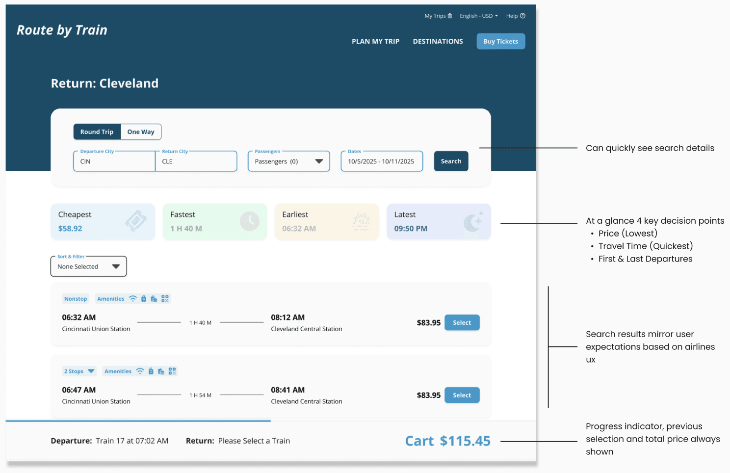
Search Results
The search results page indicates to the user where they are in their search process and what trains are available for travel. Using a similar UX to airlines, users can see, at a glance, the price, amenities, travel time, and more.

SECTION 2 OF 3
Card Details
The full view of the card enables users to see fare types in a comprehensive format. Unlike air travel, which has similar expectations for class amenities across competing airlines, train travel can vary in amenities even in the same class type across different carriers.
SECTION 3 OF 3
Brand Components
Creating interactive, brand-styled components ensured consistency across the entire flow, enabling quick modifications and testing of different page patterns.

Research
Market Analysis
My research involved analyzing multiple websites—from airlines to train operators to travel aggregators—examining page structures, identifying industry best practices, collecting design inspiration, understanding user expectations, and more.

Airlines vs Trains
Understanding the key differences and similarities between these two industries, and whether these differences would translate to the digital formats.

Takeaways
DECEPTIVELY SIMPLE
Compared to complex user roles, the overall flow of search to checkout for ticketing services is straightforward. However, simple does not mean the consumer finds the process intuitive.
QUICK PROTOTYPING
With all the prototyping done at the component level using variables and instances, the final flow assembly took me less than an hour.
COMPLEX COMPONENTS
Compared to building components in other software, I quickly discovered that each new version didn't require recreating the entire component, enabling faster iterations.
Reflection
The Power of Design Software
Before learning Figma to teach others, most of the design components I had used were built manually by fellow designers in software not intended for this purpose. The adoption of design systems and component libraries, while not new, still requires significant initial setup and stakeholder decision-making. Implementing a design system library reduces design inconsistencies and lowers the number of new designs needed. Additionally, the design system components must align with the library available to developers to avoid countless component variations.
UX Maturity of Train Travel Market
The airline industry has poured an untold amount of money into the digital experience of travel, whereas the smaller market of modern rail travel hasn't reached that level. While both markets involve similar UX process flows, the experience can vary widely.
Opportunities for Growth
While most places are accessible by air, few countries, including the U.S., have built modern rail networks. This smaller market limits the amount of digital UX maturity in train travel websites.
Next Steps
Gather user feedback using real train data rather than an imaginative U.S. travel scenario.
Expand on the initial search flow to checkout, home page, and more.
Explore more design layouts and ideas focusing on languages not based on the Latin alphabet.

